Email
Email Print
Print

Logo Highlights City, People and History of Winnipeg
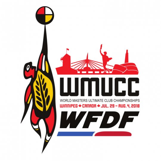
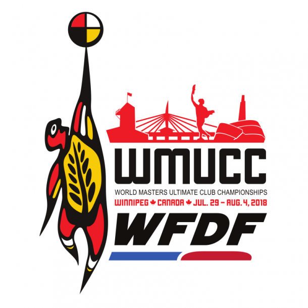
The logo for the World Masters Ultimate Club Championships 2018
It was a local artist, an immigrant from another country who now calls Winnipeg home, who created a sensitive and powerful logo for WMUCC 2018. Learn more about the artist and the logo inside...
The thought behind the logo...
"We have endeavored to create a logo which draws inspiration on many levels. Our mascot depicted in the logo is Ahcahk, who’s name is a Cree word for “Spirit” drawing inspiration from the Cree naming of Winnipeg and inspiration from the sport of Ultimate who’s most important rule is Spirit of the Game.
Ahcahk's body is a turtle made up of golden wheat which is seen on the mascots chest. The symbol of the turtle having dual representation in indigenous culture, representing mother nature and North America. The blade of wheat on the body has meaning to Manitoban’s as a symbol of growth and nourishment in the prairies of Canada. Ahcahk’s body remains gender neutral, race neutral and age neutral, openly symbolizing everyone who will participate in the games and welcoming them to our home.
The colours used represent the colours of the indigenous people of Canada using the black, white, red and yellow found in their symbolic circle seen in Ahcahk’s disc which is reaching upwards to the sky.
As the disc spins and rises, behind it is the emerging and cutting edge Winnipeg skyline, showcasing the Forks Historical site, the Canadian Museum for Human Rights, the Esplanade Riel and Winnipeg’s guardian, the Golden Boy. Giving a backdrop to the city that will be the worlds home for a part of the summer of 2018."